ASOS Digital Diagnostics Audit
A UX and technical audit of ASOS’s digital presence with strategic recommendations.
This in-depth digital diagnostics project focused on auditing ASOS’s web and email presence through the lens of UX/UI best practices, content strategy, and front-end performance. The objective was to evaluate how effectively the brand’s digital experience aligns with both user expectations and commercial goals.
I began with a structural breakdown of the ASOS desktop homepage, analysing visual hierarchy, contrast, balance, navigation flow, and content placement. I applied core design principles to identify where the layout supports intuitive browsing, and where it introduces friction. Using browser dev tools, I identified native HTML, CSS, and JavaScript elements, assessing their role in loading performance and interactivity.
The project also included an audit of ASOS’s promotional emails. I reviewed how typography, call-to-actions, and brand consistency influenced user engagement and retention. Drawing on UX design principles, I offered improvement suggestions related to layout clarity, mobile responsiveness, and visual storytelling, all supported by strategy-first reasoning.
Finally, I outlined technical SEO factors including metadata, site speed, and mobile usability. If I were continuing the project, I’d layer in competitor benchmarking, category-level UX audits, and mobile-first analysis to sharpen the strategic insight.

I evaluated ASOS's homepage using Jakob Nielsen’s design heuristics and visual UX principles such as hierarchy, balance, contrast, and whitespace. I assessed how the homepage supports (or hinders) user flow, conversion intent, and product discovery. Although the homepage establishes a strong brand tone, it introduces friction through crowded modules and unclear CTA hierarchy. The category and product pages were also briefly reviewed for layout consistency, navigability, and filtering usability, though a full category-level audit was scoped as a potential next step.
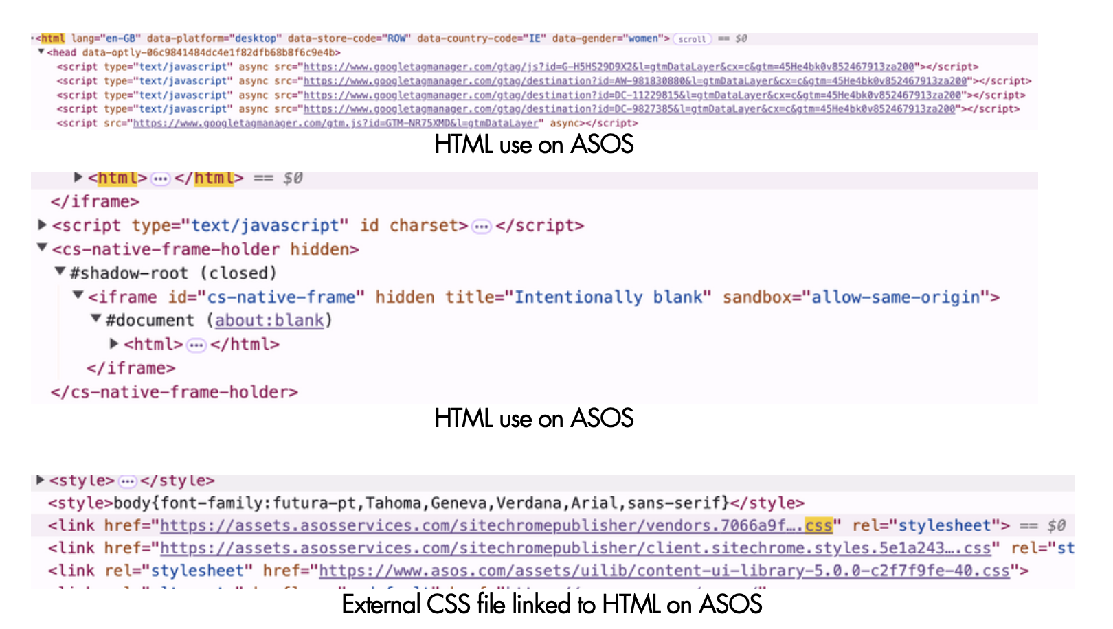
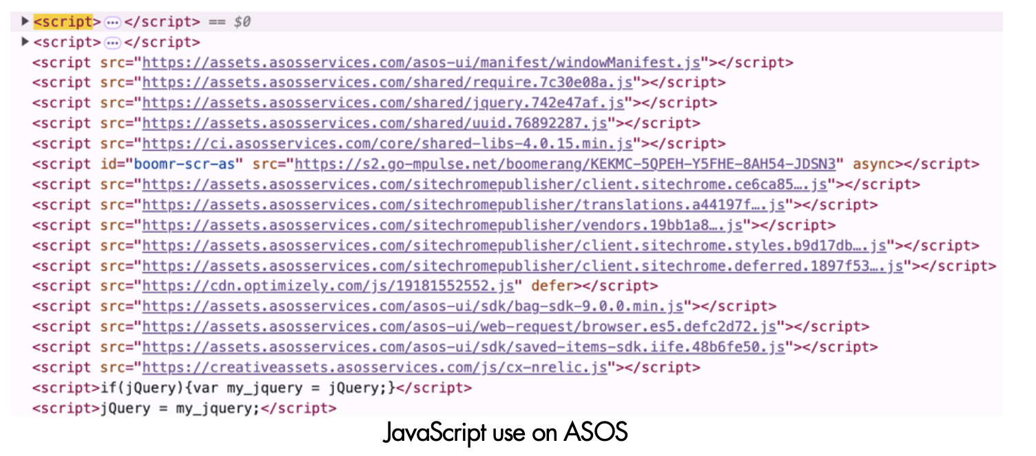
I used browser developer tools to inspect ASOS’s native code, identifying the core HTML structure, CSS stylesheets, and JavaScript functionality. The site relies heavily on JavaScript for interactivity, which can impact loading speed and mobile performance. Metadata was present but could be enhanced for richer SERP appearance. Key technical SEO factors such as mobile responsiveness and page load speed were analysed using both manual inspection and Lighthouse testing.

I reviewed ASOS’s promotional emails using UX copywriting best practices to evaluate clarity, tone, personalisation, and conversion cues. I structured the audit by breaking down the email’s subject line and body copy, benchmarking each element against engagement heuristics. ASOS generally performs well, using concise, personal language and lifestyle-focused content. However, there is an opportunity to enhance hierarchy through layout changes and clearer CTA positioning in mobile versions, something I would mock up as a next step.
If I were to continue this diagnostic, I would extend the UX and technical audit across ASOS’s full category navigation and post-purchase funnel. I would also create redesigned email mockups to improve layout clarity and mobile responsiveness, particularly for promotional campaigns. Overall, this audit highlights strengths in tone and branding, but reveals opportunities to reduce friction, improve clarity, and optimise performance across devices.